


Branding
Luxury vs. Local: Designing a Real Estate Brand That Feels Like You
November 3, 2025
In real estate, everyone wants a brand that looks good.
But what makes a brand feel right — the kind that instantly connects with your clients — is how well it reflects you and the market you serve.
Some agents want their brand to look elevated and high-end — the luxury look.
Others thrive on local familiarity — approachable, grounded, and connected to community.
The truth?
There’s no right or wrong direction. But there is a wrong fit.
Your brand should never look like you’re pretending to be someone you’re not.
Let’s break down the difference between luxury and local branding — and how to find your balance.
When agents think “luxury,” they often picture black-and-gold logos, serif fonts, and elegant homes in their feed.
But true luxury branding isn’t about color palettes — it’s about confidence, restraint, and clarity.
Luxury brands communicate trust through simplicity.
They don’t need to say “luxury” — they show it through consistency, tone, and design that never feels cluttered or loud.
It works best for:
Be careful:
If you’re working in mid-market or smaller communities, “luxury” can easily feel disconnected.
You can still look high-end without looking out of place.
.jpg)
Local branding isn’t “lesser.” It’s actually harder to do right.
The best local brands feel authentic — warm, human, and community-rooted.
That might mean brighter colors, personal photography, or stories that highlight the people and places you work with.
It works best for:
Be careful:
Too many “local” brands end up looking casual or inconsistent.
Approachable doesn’t mean unpolished — your brand can still be professional without losing its human touch.
You don’t have to pick one side.
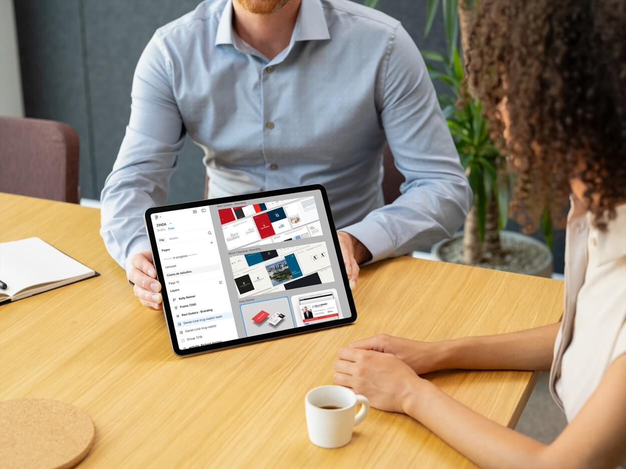
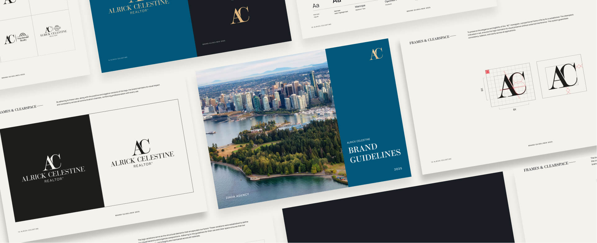
Some of the best brands we’ve designed at Zinda sit right between both worlds.
For example, Kelly Reimer wanted a brand that felt modern and personal — clean lines, warm tones, and approachable photography.
It’s modern, high-end, but still friendly enough for the local families they work with.
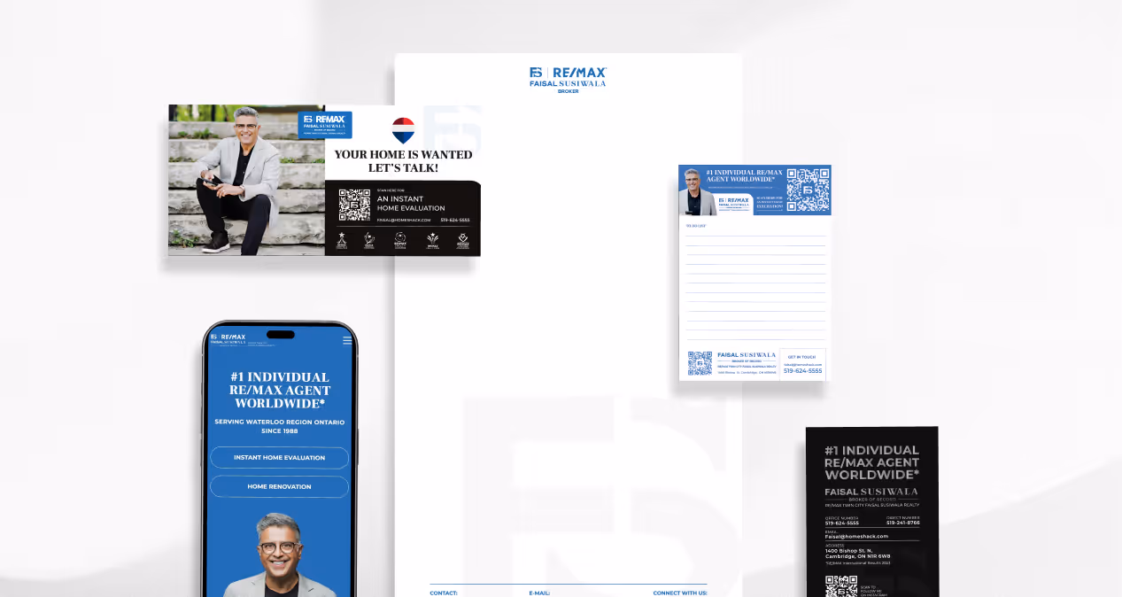
Meanwhile, Faisal Susiwala has built a brand that speaks to authority and legacy — but his content bridges trust and education, showing that “luxury” can still feel personal.
Your brand can be elevated and local — as long as it feels like you.

Before you worry about fonts or logos, think about your clients.
Are they high-net-worth buyers who expect discretion and polish?
Or are they families who want to see that you genuinely understand their community?
Design follows direction.
Once you know who you’re talking to, your color palette, photography, and tone will fall into place.
The biggest mistake agents make is copying what looks good instead of what feels right.
Your brand isn’t supposed to look like every other agent’s — it’s supposed to sound and look like you.
At Zinda, we build real estate brands that blend luxury and local — clean, timeless, and true to who you are.
We help you find that balance between “professional” and “personal,” so your brand actually connects.
👉 Want to see how different brand styles can still feel authentic?
Explore our Real Estate Portfolio
.jpg)


.jpg)

.jpg)