Your color palette is one of the most powerful brand decisions you will make. At Zinda Agency, we help real estate agents choose colors that communicate the right things to the right clients, and stay consistent across every piece of marketing they produce.
Before a prospect reads your name, they've already processed your colors. The right palette signals luxury, trustworthiness, or energy depending on what your market expects. The wrong one signals nothing at all.
The agents who own a market don't just have a logo. They have a color that people associate specifically with them. When your yard signs, social headers, flyers, and business cards all share the same palette, that's when a brand starts to stick.
Color communicates before language does. The right palette for a luxury condo specialist is a completely different conversation than the right palette for a first-time buyer's agent in a growing suburb.

Trust, reliability, and professionalism. The most common color in real estate for a reason.

Energy, urgency, and confidence. Effective for agents with a bold, high-energy brand presence.

Growth, balance, and community. Works well for agents in residential or family-focused markets.

We start by understanding your market positioning, your niche, and the clients you're trying to attract. Luxury buyers respond to different colors than growing families. We need to know who you're speaking to before we recommend anything.

We learn your niche, target client, and market positioning.
We map the emotional response each color direction would create with your specific audience.

We look at what other agents in your market are doing, then make sure yours is clearly different.
Distinctive doesn't mean loud. It means unmistakably yours.

We present 2 to 3 color palette directions, each with clear rationale.
You choose your direction, and we lock in the final palette in HEX, RGB, and CMYK, ready to apply to every material.

Vilensky Realty Color Palette
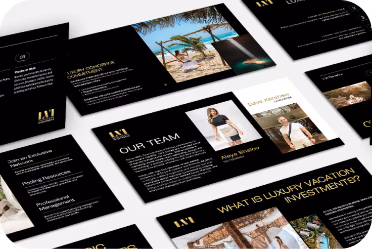
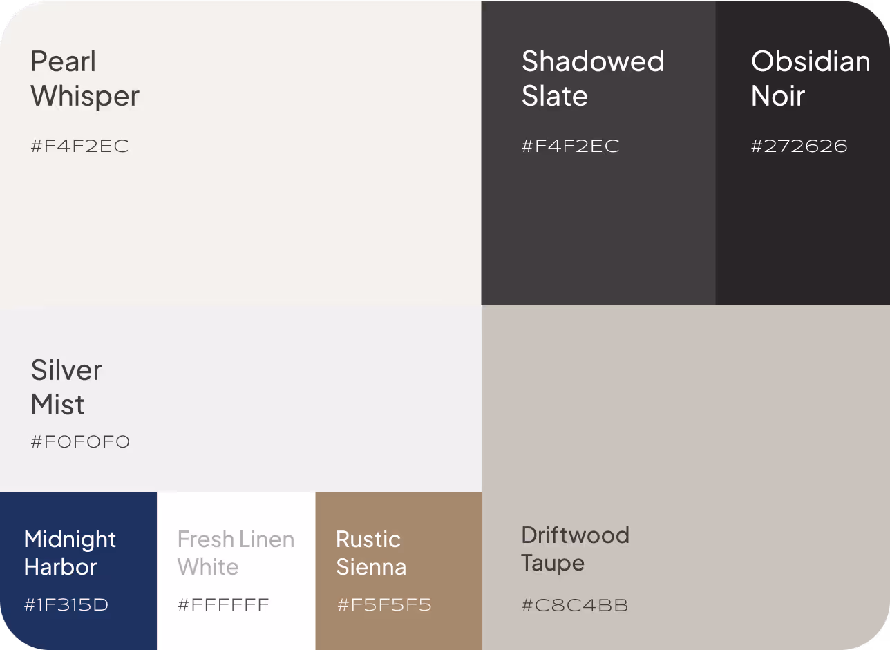
LVI Color Palette

Hamid Khan Color Palette