Not every logo is built the same way. Your real estate brand needs variations that work at business-card size, on a billboard, in dark mode, and on a white background. Understanding the three main logo types helps you build a brand that holds up in every context you'll ever need it.

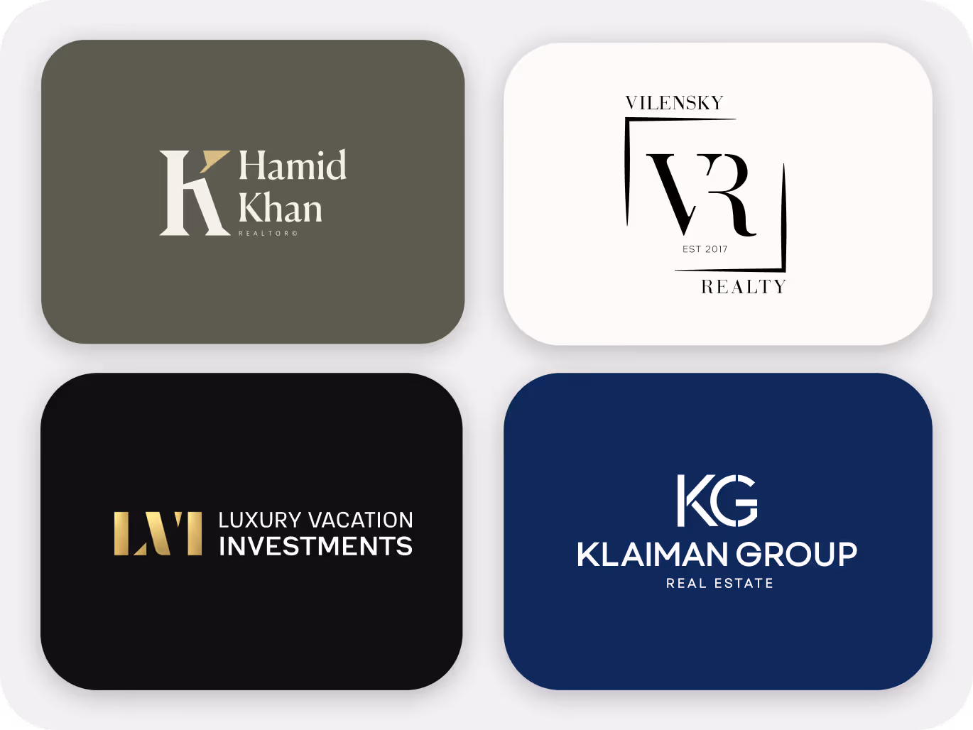
A imagotype logo prominently features the name of the company in a stylized font, often combined with an accompanying logo icon or symbol, creating a mark that communicates both your name and a visual identity at the same time. The most common logo format for real estate agents. Flexible, recognizable, and works across print and digital.
• Brand Recognition: Emphasizes both the brand name and icon, aiding in immediate recognition.
• Clarity: Provides clear and straightforward communication of the brand's identity.
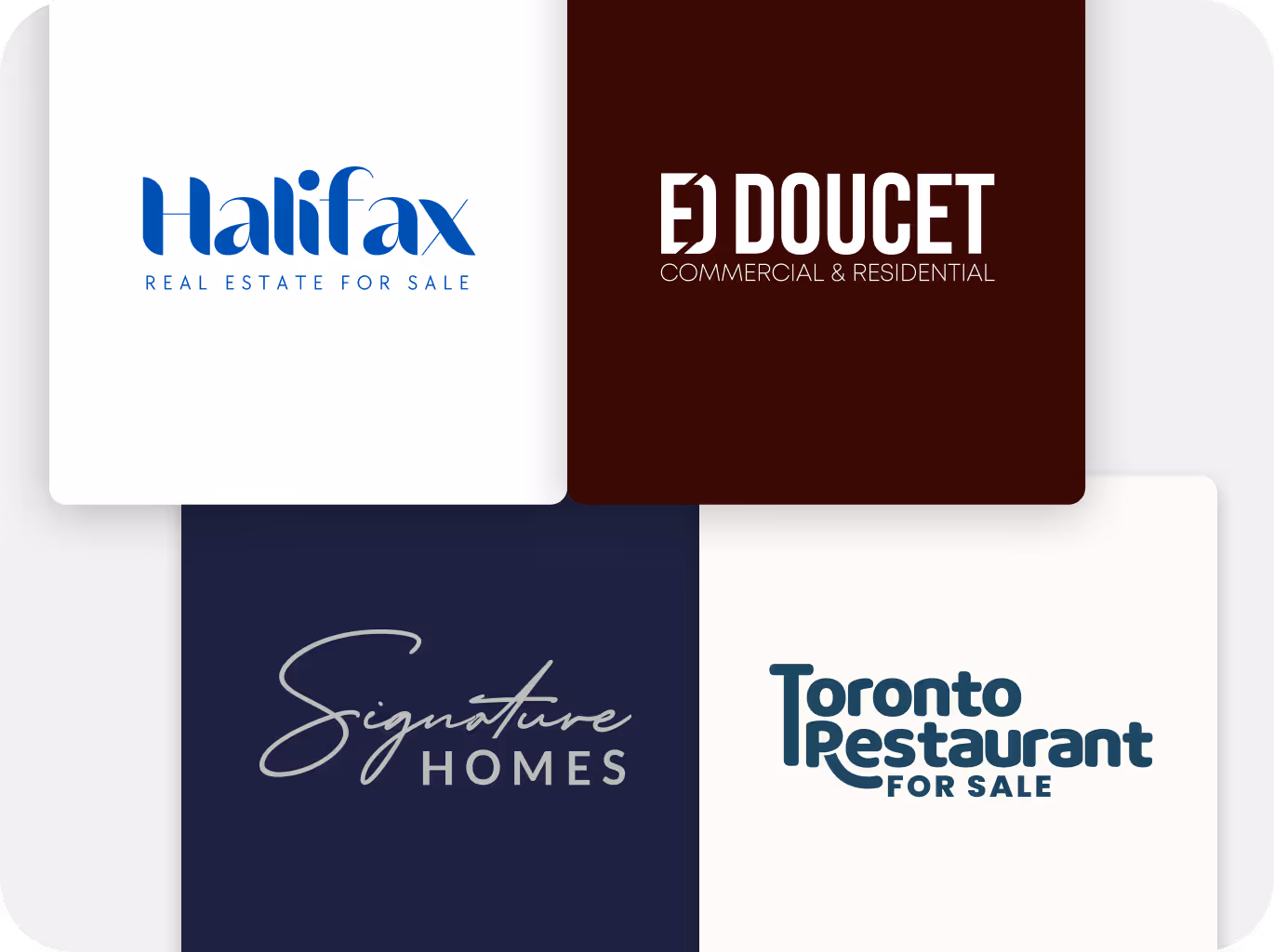
A wordmark uses your name, styled typographically, as the entire logo. No icon. No symbol. Just the strength of your name, set in a way that's unmistakably yours. Works especially well for agents building strong name recognition in a specific market.
• Brand Recognition: Emphasizes the brand name, aiding in immediate recognition.
• Clarity: Provides clarity and straightforward communication of the brand name.
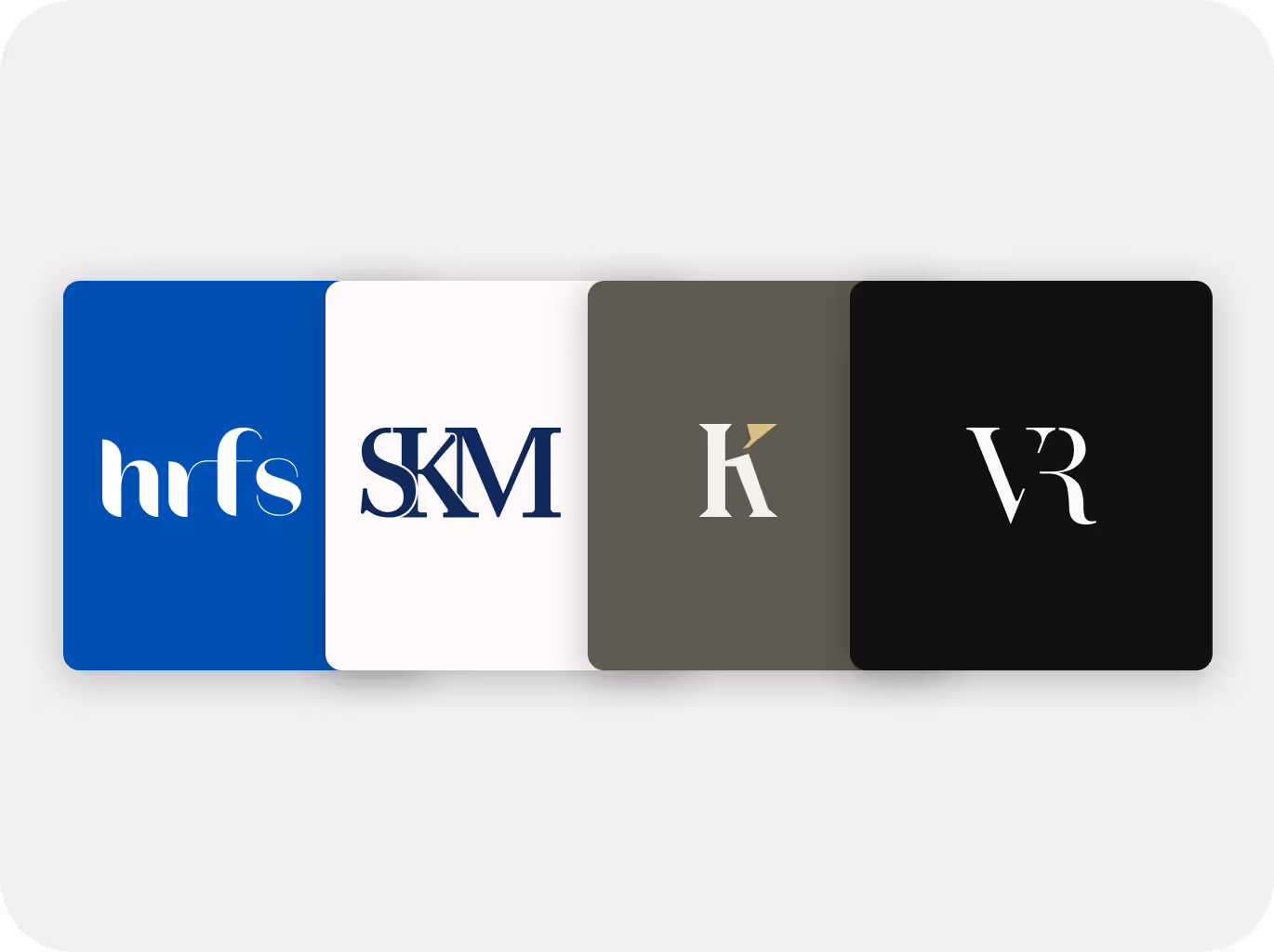
A lettermark logo uses your initials or a short acronym. Compact, clean, and versatile. Works at sizes where spelling out your full name would be illegible.
• Simplicity: Condenses brand identity into a compact design.
• Versatility: Easy to adapt across various marketing materials and platforms

Each version of your logo should feel like the same brand. Same color, typography, and key graphics. The format changes. The identity doesn't.

Every variation should hold up at any size and on any surface. Business cards, yard signs, social media icons, email footers. A variation that only works in one context isn't a real variation. Test it in every logo variations are versatile, looking good and being readable across various mediums, sizes, and color mode and at every size.
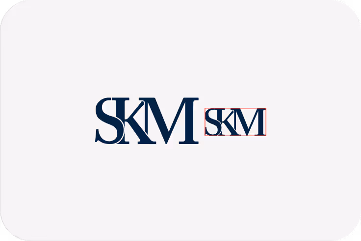
If you can't recognize it at 16 pixels, it's not simple enough. Great logo variations strip away complexity until the mark is memorable at any scale.