


Font Pairings for Real Estate Agents Who Want Their Brand to Look the Part
Font Style That Describes Your Brand
Typography is one of the most overlooked parts of a real estate brand. Most agents use whatever font came with their template and never revisit it. At Zinda Agency, we help real estate agents choose and pair fonts that make their brand look intentional, consistent, and professional across every material.
Why Font
Style Matters
First Impressions
Your typography communicates before your words do. A serif heading signals established and trustworthy. A clean sans-serif signals modern and efficient. Clients looking at your branding materials are already forming opinions about your professionalism based on your type choices alone.
Brand Consistency
If your website uses a different font than your flyers, and your email footer uses whatever the platform defaulted to, your brand looks assembled rather than designed. Consistent typography is what makes your website, business cards, or brochures feel like a unified, professional package.
Emotional Impact
A serif heading says established and trustworthy. A clean sans-serif says modern and efficient. A script accent says personal and boutique. Your fonts are doing more brand positioning work than you might realize:
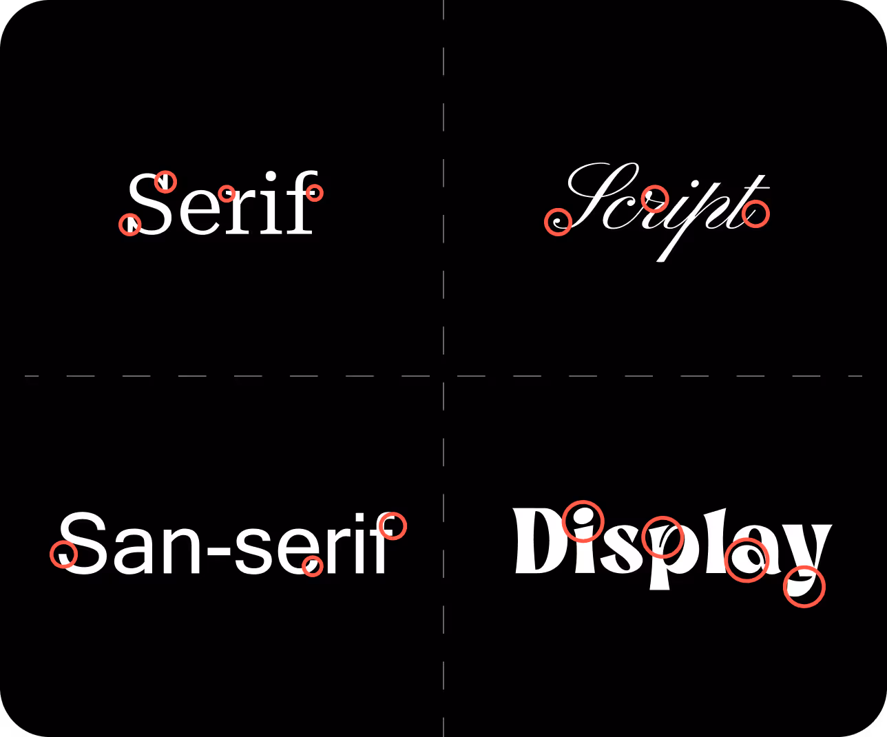
Font Styles

Serif Fonts:
Small decorative strokes at the ends of letterforms. Classic, established, trustworthy.
Traditional, reliable, and elegant.

Sans-Serif Fonts:
Clean strokes with no decorative elements. Modern, direct, and easy to read at any size.
Modern, clean, and straightforward.

Script Fonts:
Flowing, handwritten-style letterforms. Personal, boutique, and warm.
Elegant, personal, and creative.

Display Fonts:
High-impact, expressive letterforms built for headlines and signage. Use sparingly.
Bold, unique, and attention-grabbing.
Our Process
Typography doesn't live alone. It works alongside your logo, colors, and layout. We make sure your font pairings do their job at every size and in every context, from a website headline to a business card footer.

1. Brand Discovery
We analyze what fonts your direct competitors are using in your market, so we can steer you somewhere distinctive without going off-brand.

2. Market Research
We look at local and national real estate brands to identify what's overused and what creates a clear point of difference.

3. Font Selection
We present 2 to 3 typography directions, each with headline, body, and accent font pairings.
You choose your direction and we finalize the complete font system with full usage rules.

4. Implementation Guide
You get a complete typography spec: which fonts go where, at what sizes and weights, and how to apply them across every piece of your brand.
Any vendor, designer, or tool you use produces materials that look like they came from the same place.
Examples of Successful Font Styles

Classic and Elegant:
A combination of a serif font for headings and a sans-serif font for body text to create a timeless and professional look.

Modern and Minimalistic:
A clean sans-serif font for both headings and body text to convey simplicity and modernity.

Creative and Inviting:
A playful script font for accents paired with a legible serif or sans-serif font for body text to add a personal touch.