


Branding
The Biggest Mistakes Agents Make When Designing Their Logo

Carolina O. Hoyos - Creative Director
February 5, 2026

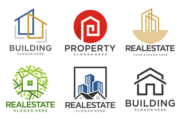
Let’s be honest — real estate logos are some of the most overused designs on the internet.
Gold houses, cursive initials, rooftops, monograms — you’ve seen them all.
And yet, most agents still start their “branding” by rushing to design a logo before they even know what makes them different.
If you’re about to update your logo (or create one from scratch), here are the biggest mistakes to avoid — and what to do instead if you actually want a brand that stands out.
The most common mistake?
Jumping straight into colors and symbols without defining who you are, who you serve, or how you want people to feel when they see your brand.
Without that clarity, your logo becomes just decoration — not direction.
Do this instead:
Start with your brand foundation: audience, tone, and values. Once those are defined, your logo can reflect your brand instead of trying to create it.
If your logo looks like every other agent’s — you’ll be forgotten as quickly as the next listing post.
Generic icons (like houses, keys, rooftops, or initials with fancy fonts) don’t build recognition — they dilute it.
A brand only stands out when it tells a story that’s yours.
Do this instead:
Avoid stock icons and overused symbols. Use your design to express your style, not your industry.
For example, if your tone is minimalist and modern — focus on typography and spacing. If your brand is more luxury — lean into simplicity and texture, not sparkle.
A logo isn’t meant to impress you — it’s meant to attract the clients you want.
Too many agents design logos based on personal taste (“I love gold!”) instead of what speaks to their ideal audience.
Do this instead:
Ask: who am I trying to connect with? What would appeal to them?
If you work with downsizers, use calm and trustworthy tones.
If you’re targeting investors, go bold and confident.
If you’re in the luxury space, embrace restraint — not glitter.
More lines, shadows, gradients, or icons don’t make your logo more “luxury.”
They just make it harder to use.
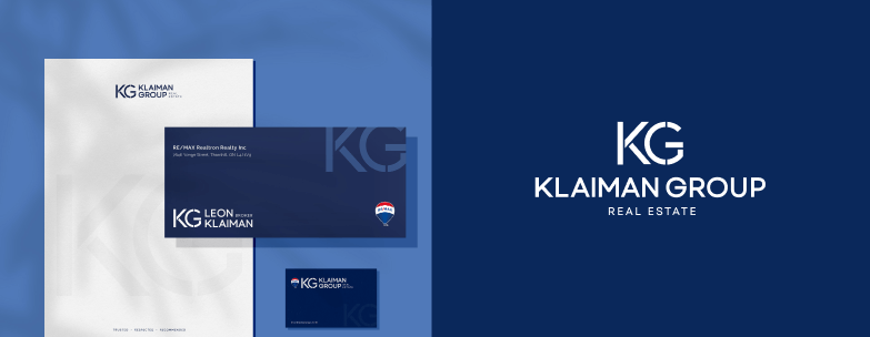
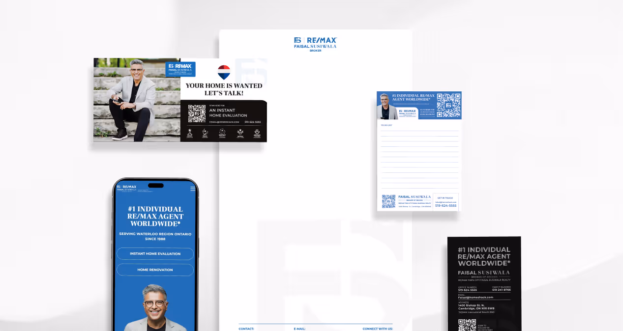
A great real estate logo should look good on a billboard and a business card, in color and black and white.
Do this instead:
Keep it simple, scalable, and flexible.
A clean logo feels professional because it shows confidence in your brand.
A strong logo means nothing if it’s used inconsistently.
If your website, social posts, and flyers all have different fonts or color tones, your audience won’t connect your materials to a single identity.
Do this instead:
Create a simple brand guide with your logo versions, colors, and fonts. It’s not about rules — it’s about recognition.
Your logo is a symbol of your brand — not the brand itself.
Branding is about how you communicate, what you stand for, and how you make people feel when they work with you.
Without that foundation, even the nicest logo is just surface-level.
If your logo doesn’t feel right, the issue probably isn’t the design — it’s the missing brand strategy behind it.
At Zinda, we help real estate agents build brands that look sharp, feel aligned, and actually reflect who they are.
We don’t just make logos — we create brand systems that grow with you.
Explore our Real Estate Portfolio

.jpg)

.jpg)