In the real estate sector, your logo serves as your brand's permanent ambassador. It is not just a symbol; it is the tool that communicates your professionalism, differentiates you from competitors, and builds trust before the first point of contact.
At Zinda Agency, we have curated 20 visual identities from high-performing agents and firms to analyze why they succeed in the current market. Whether you are looking to refresh your image for 2026 or build a brand from scratch, these examples set the standard for design excellence.
What Makes a Real Estate Logo Effective?
A winning logo must tell your story at a glance. To achieve this, we focus on these fundamental pillars:
Absolute Clarity: Less is more. We use limited color palettes and clean typography for easy reading across any format.
Unique Identity: Your brand should move away from generic house or key icons. We look for original shapes that cannot be confused with the competition.
Total Versatility: The design must look perfect on both a mobile screen and a highway billboard. The image must be adaptable and recognizable at all times.
Purposeful Symbolism: Every line has a reason. We use space and form to create depth, suggesting growth, security, or connection.
Below, we analyze some of our favorite cases, detailing why their design serves as such a powerful sales tool.
1. Aleya Real Estate
Aleya Real Estate a top-ranked Vancouver leader with 20 years of luxury experience and RE/MAX Hall of Fame status.
Why this logo works: The logo features a minimalist, geometric "A" monogram that creates a sleek, high-end architectural feel. Its clean lines and wide-spaced typography communicate a sophisticated "Real Estate Redefined" aesthetic, perfectly suited for the luxury market
2. Vilensky Realty
Vadim Vilensky uses legal expertise and a tireless work ethic to provide top-tier representation. His team specializes in skilled negotiation for properties of any size.
Why this logo works: The mirrored "VR" monogram in an open frame symbolizes transparency and a modern perspective. High-contrast serif typography communicates sophisticated professional authority.
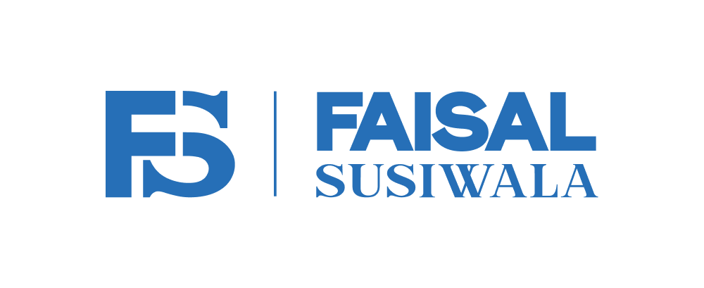
3. Faisal Susiwala
Entering real estate at 18, Faisal is now Canada’s top agent. He combines decades of expertise with a relentless drive for client success.
Why this logo works: Bold, heavy typography conveys market dominance. The intertwined "FS" monogram symbolizes a seamless connection between agent and client.
4. The Sharif Sister
The Sharif Sisters With 29+ years of experience in Kitchener-Waterloo, they provide honest, lifestyle-driven guidance through deep local knowledge.
Why this logo works: Elegant serif typography reflects long-standing trust. The layered "S" monogram adds modern sophistication.
5. Ravi Godara
A GTA expert specializing in residential and commercial properties. Ravi as a TREB Awareness Ambassador, he leads a team focused on referral-based success.
Why this logo works: The intertwined "RG" monogram symbolizes professional synergy. The navy palette and modern sans-serif type communicate stability.
6. Alrick Celestine
Provides strategic luxury guidance in Vancouver backed by 15 years of experience. His approach combines investment acumen with a passion for architecture.
Why this logo works: The intersecting "AC" monogram suggests architectural precision. Deep turquoise tones convey a refined identity rooted in discretion.
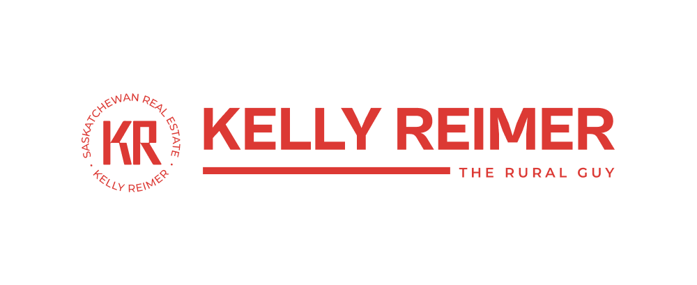
7. Kelly Reimer
"The Rural Guy" helps Saskatchewan homeowners maximize property investments with friendly, expert advice.
Why this logo works: A vibrant red palette and blocky "KR" monogram evoke energy. The circular stamp design establishes a "seal of approval" feel.
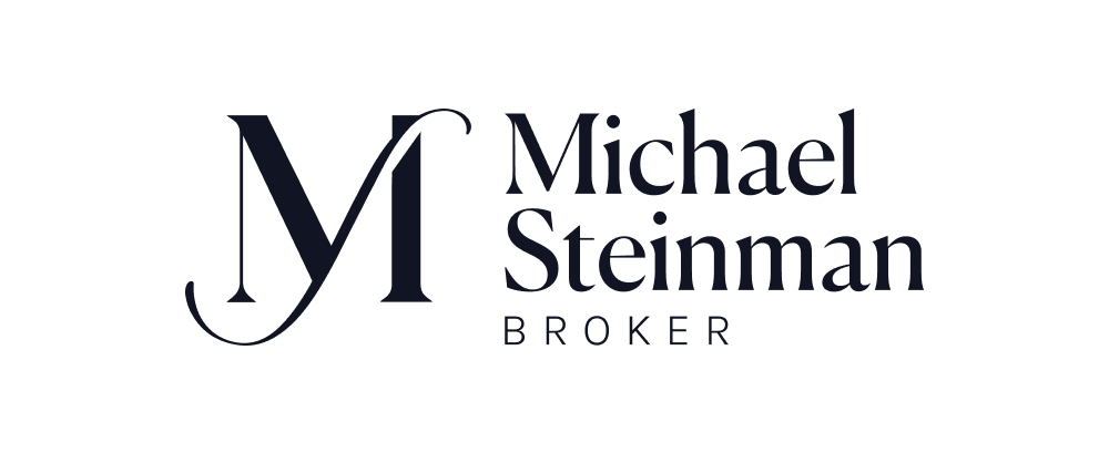
8. Michael Steinman
Michael Steinman a seasoned broker known for driving growth by strategically navigating complex real estate markets.
Why this logo works: An oversized "M" monogram with flourishes suggests high-end service. The clean "BROKER" subline balances tradition with modern professionalism.
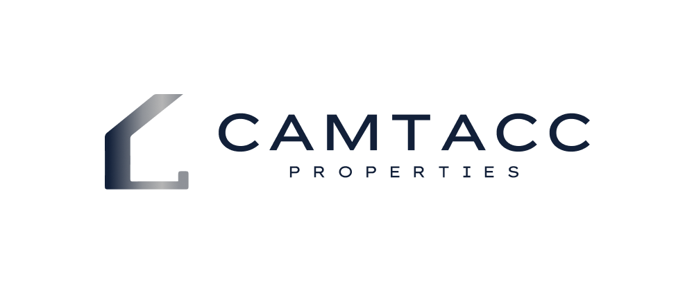
9. Camtacc Properties
Camtacc specializes in luxury property sales with a focus on innovative design and market expertise. They are committed to delivering professional, modern service to help clients find high-end ideal homes.
Why this logo works: The logo uses a sleek, stylized house outline with a metallic gradient that suggests modern luxury and high-quality construction. The bold sans-serif typography and wide letter spacing project a professional, established corporate identity.
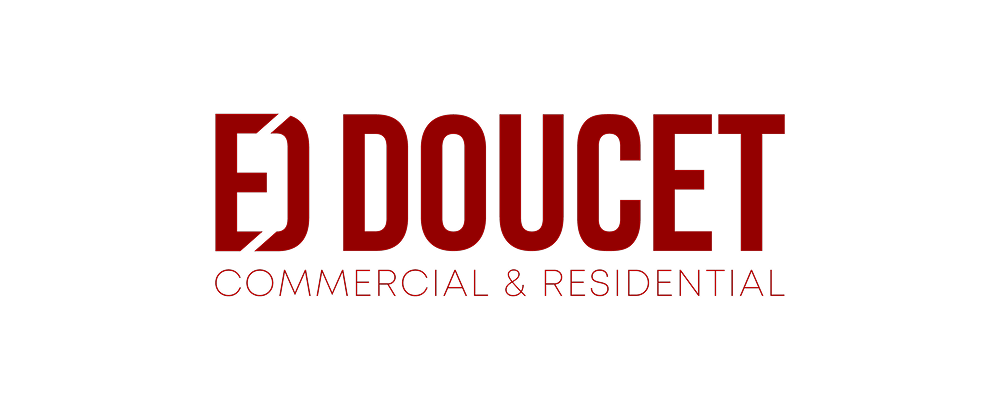
Why this logo works: The stencil-style "ED" monogram suggests industrial strength and precision. The deep red palette communicates stability and a dominant market presence.
11. Philip Hollett
Philip Hollett Empowers clients through education on homeownership and renovations.
Why this logo works: The rounded "PH" monogram and vibrant colors suggest a friendly personality. Clean sans-serif type reflects clear communication.
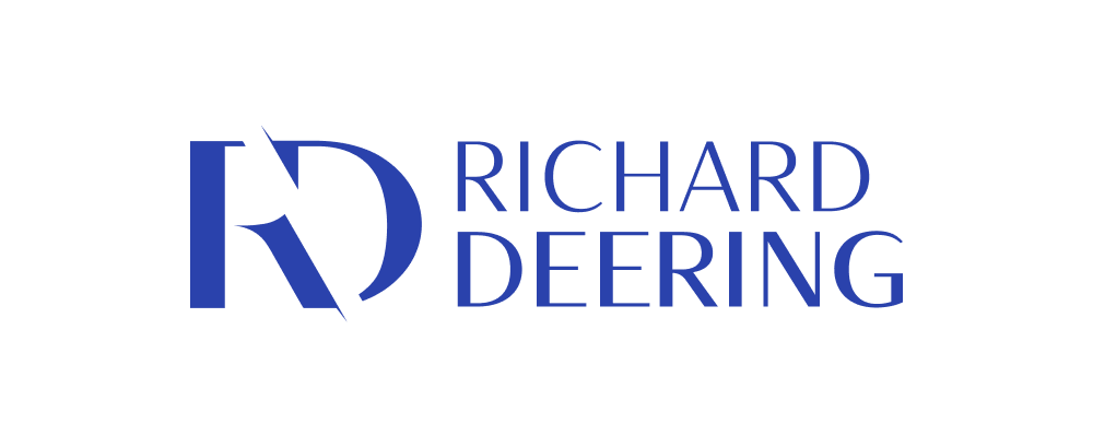
12. Richard Deering
Richard Deering a Calgary native providing deep local insight into every neighborhood with genuine care.
Why this logo works: The sharp "RD" monogram suggests precision and forward motion. The bold blue palette communicates energy.
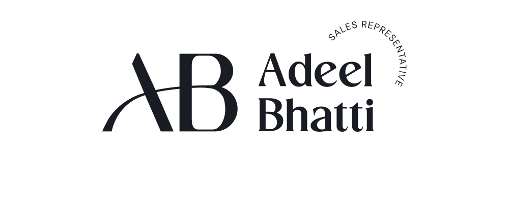
13. Adeel Bhatti
Adeel Bhatti aligns homes with specific lifestyles in London across residential, commercial, and multi-family sectors.
Why this logo works: An arcing line in the "AB" monogram suggests a bridge, symbolizing his role in connecting clients to ideal properties.
Why this logo works: Bold, rounded typography creates a friendly aesthetic. The unique "T" and "R" connection symbolizes the link between the market and opportunities.
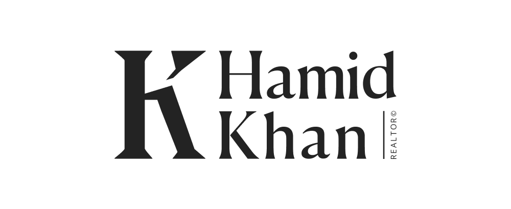
17. Hamid Khan
Hamid Khan Native to Cambridge with 15 years in real estate investment and deep community ties.
Why this logo works: An oversized "K" projects architectural authority. The black-and-white palette communicates timeless elegance.
18. Jenna Lee Cody
Jenna Lee Cody a second-generation realtor with 10 years of experience and deep community roots. She combines natural business talent with strong national connections to deliver seamless results.
Why this logo works: The intertwined "JLC" monogram creates a high-end boutique feel. Pairing a classic serif font with the clean "FROM START TO SOLD" tagline balances traditional authority with modern efficiency.
19. Signature Homes
Signature Homes Focuses on personalized customer care for custom builds in Halifax.
Why this logo works: Elegant script suggests a handcrafted touch, while bold "HOMES" type provides a professional foundation.
20. HRFS (Halifax Real Estate For Sale)
An SEO-driven platform created by Sandra Pike to simplify home searches in Halifax. It offers neighborhood-specific MLS searches and valuable community resources.
Why this logo works: The flowing, wave-like serifs in the "Halifax" typography evoke the coastal nature of the region. The vibrant blue tone and clean sans-serif subline project a modern, community-oriented digital resource.

.jpg)


.png)